ECoach
ECoach is a personalized, web-based coaching tool that gives students in a course tips about how to best approach the course, personalized feedback on their performance, and tools to help them succeed, like to-do lists, exam playbooks, and a grade calculator.
ECoach helps students prioritize the most important tasks each week, track their progress on grades and study habits, and improve their grades by providing tailored strategies.
ECoach helps faculty support their students at scale.
Role - UX Design Lead, Project Lead, Design & Development Mentorship, Creative Direction

The Problem
The student side of ECoach had been in use for several years without a comprehensive evaluation. Over this time, students reported usability challenges and noted that they faced difficulties in navigating the tool's interface to access information. Support tickets from students signified persistent issues, highlighting a need for significant improvements to enhance the overall usability. Furthermore, the tool exhibited accessibility shortcomings, creating barriers for users with disabilities.
Navigation structure and display led to usability issues
Lack of clarity on task completion
Key components were hierarchically misrepresented
Lack of adherence to accessibility standards
Goals
Revamp the ECoach student design by addressing usability issues, enhancing accessibility, and ultimately improving the overall user experience. Implement user-centric design principles and strictly adhere to accessibility guidelines.
Heuristic Evaluation + Observations
To enhance our grasp of the tool's problem areas, we began by conducting a heuristic evaluation. We also offer students the opportunity to provide feedback in an End of Term survey, where they called out their usability concerns using ECoach.
Survey Results
2.9k
respondents
7
unique coaches
8.8%
noted UI/UX issues
A UI/UX issue mentioned in all coaches was difficulty with navigation, which was in part due to a layout/organization students find cluttered and non-intuitive.
“The UI is perhaps too colorful in my opinion and keeping track of where to head for things is not very noticeable.”
“Maybe make the web page a little easier to look at. I feel there is too much information present on the same page at once and it's a little bit confusing sometimes.”
By combining the findings from the evaluation and the survey with observations made by the team, we identified the most crucial concerns that required attention.
The navigation structure caused a number of usability problems. Items under the account dropdown were often overlooked and rarely visited.
The beginning of the message was previewed on the homepage, but you needed to visit the Message Center to read the full message, causing the preview to add little value. The preview also caused accessibility issues, both due to the lack of context the content had and the interactive message components interfering with screen reader flows.
The Quick Links panel was the primary way to navigate to secondary pages. However, it was only available on the homepage. Additionally, it was a mix of internal feature pages and external resources, which caused confusion.
The to-do list was placed in an unfavorable position on the page, even though it was a popular feature. Students noting a preference to see it higher on the page. Additionally, it was only accessible from the homepage.
The homepage Message Center is disjointed from the featured message in the top left. Additionally, the content shown alongside each message link is not very informative of the message content.
Additional issues to address
Navigation as a whole was problematic. Some items were contained in the account dropdown under the student’s name, other were contained solely on the homepage, combined with external links
The layout and design could use a declutter and considerations around the hierarchy
Students struggled to know when they had items available to complete.
Students often reach out to inquire whether or not they completed an assignment and / or received credit
In some places, naming conventions didn’t match student’s mental models

The Solution
Revised Brand and System Design
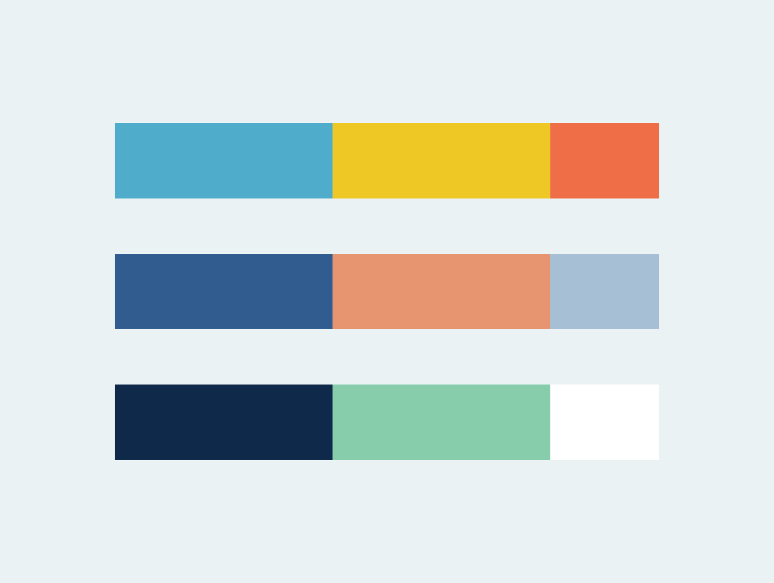
The revised ECoach brand utilizes friendly rounded corners and soft edges for components such as cards, iconography, and illustrations. The color palette is a mix of bright, saturated colors with complementary, inviting pastels. The use of bright colors is used minimally, intentionally toned down across the interface in comparison to the previous version. This design decision allows for a clean, minimal design approach that addresses concerns with color and clutter.

UI/UX Design Iterations
In response to noted concerns, alongside the branding updates, I took proactive steps to address and resolve the issues raised regarding the interface. The following text highlights the considerations made and updates implemented. These efforts aimed to enhance product quality and maximize user satisfaction. The updates have led to significant improvements in both areas.
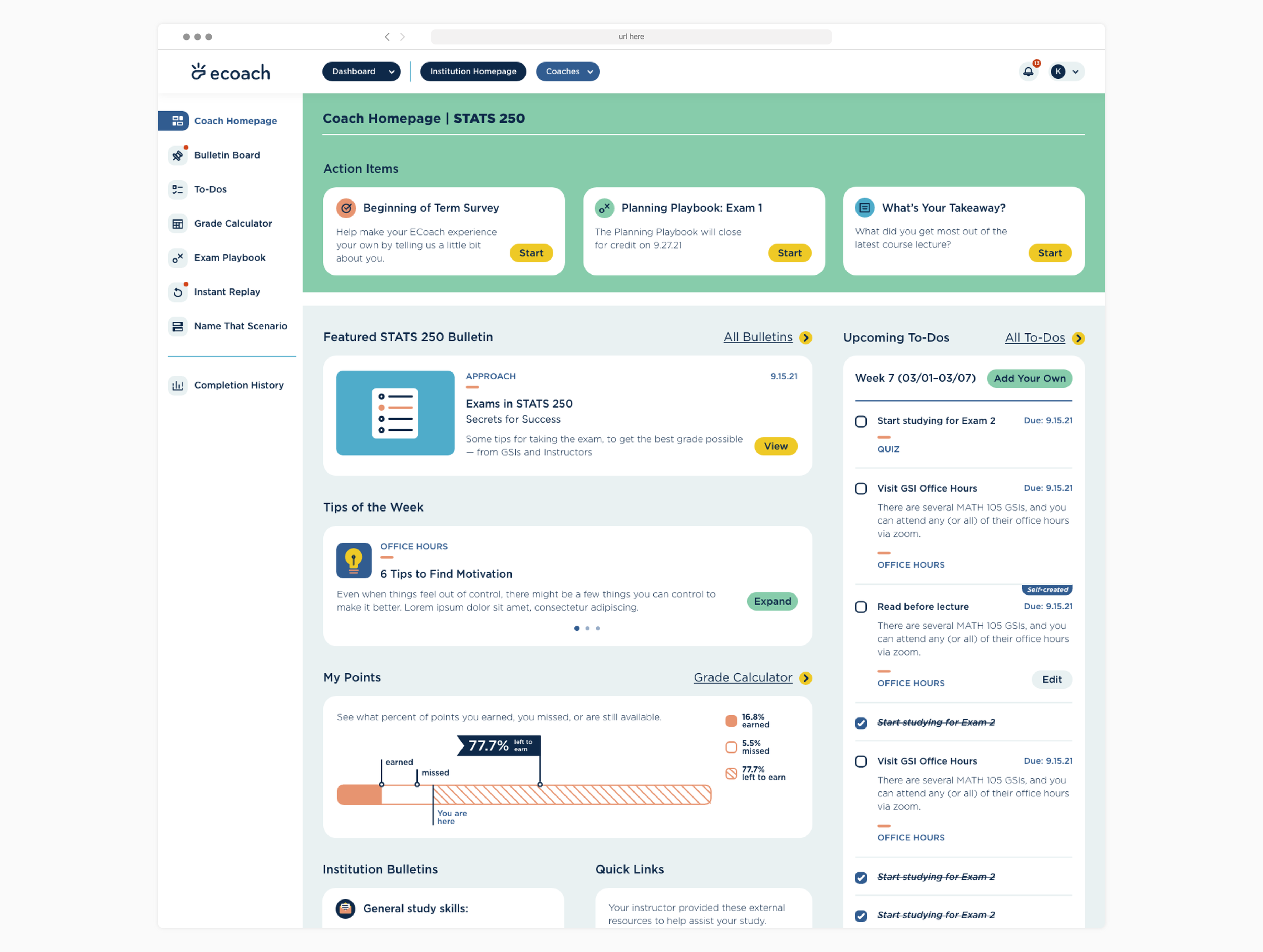
Side navigation
Moving the coach-level navigation to a side menu allows all pages to be accessible regardless of where you venture in the site and also serves to provide insight on all available pages / features.
Clarity is gained on how to navigate back to the homepage along with where to find the status of assignment completion.
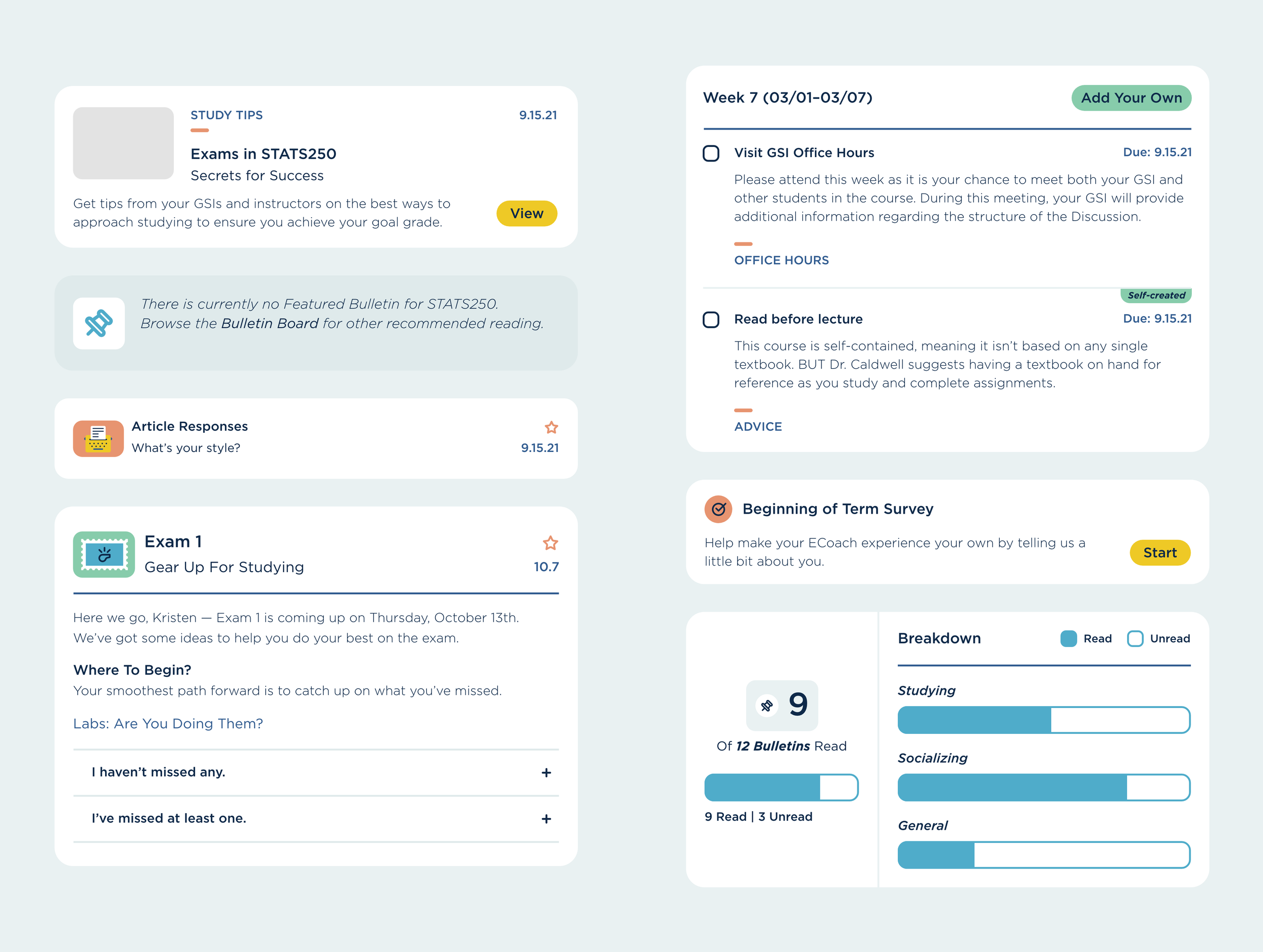
Action items
A dedicated space at the top of the homepage provides clear direction on what “action items” a student has within the tool
To-do list alongside feature message
The to-do list was moved alongside the featured bulletin for easier access
A dedicated page was built to house the to-do lists
Renaming “Message”, “Message Center” to “Bulletin” “Bulletin Board”
Student’s found this better matched their mental model and aligned with the ECoach brand
Featured Bulletin
The preview was removed to alleviate accessibility issues and a short description of what to expect within the bullet was put in its place
Quick Links is solely external resources
Credit status
This component was introduced to all “for credit” items throughout the interface, with 3 states: “for credit”, “credit status: check” (received), and “credit status: x” (missed)
A detailed assignment table was added to the “Completion History” page show all credit items and their status in one place

Validating the Updates
Usability Testing
5
tasks
10
students interviewed
100%
ECoach background knowledge
Outcomes
Students like the look and feel of the new dashboard - the colors are “gentle” and “engaging”
The layout is “clean” and “organized”, and students can find what they need relatively easily
Noted that it felt less cluttered than the current version
Support tickets from students regarding whether or not they completed an assignment and / or received credit was drastically reduced
Brand Identity - Extended
ECoach utilizes friendly rounded corners and soft edges for components such as cards, iconography, and illustrations. The color palette is a mix of bright, saturated colors with complementary, inviting pastels. The use of Gotham adds to this comforting aesthetics, as it offers rounded characters with a rather tall x-height. All of these combined decisions make ECoach an approachable, welcoming tool.


Student Features
Since then ECoach has expanded its feature set to include far more than just messaging. The student side of the tool now offers:
Bulletin messages
Surveys to gather student data
To-Do lists developed by their professors and / or GSI
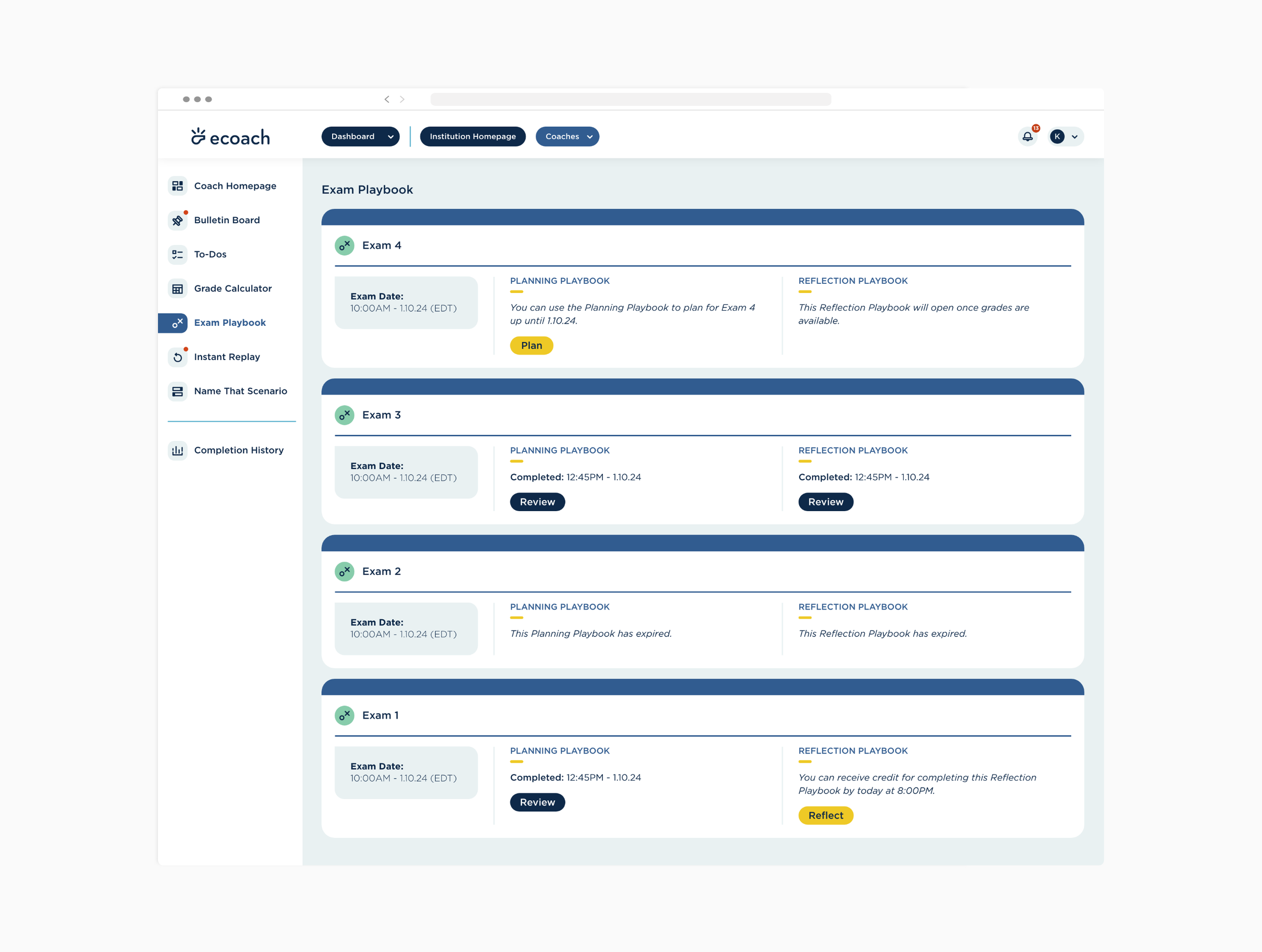
Exam Playbooks to prepare and then reflect on their exam results (research publication)
Weekly tips
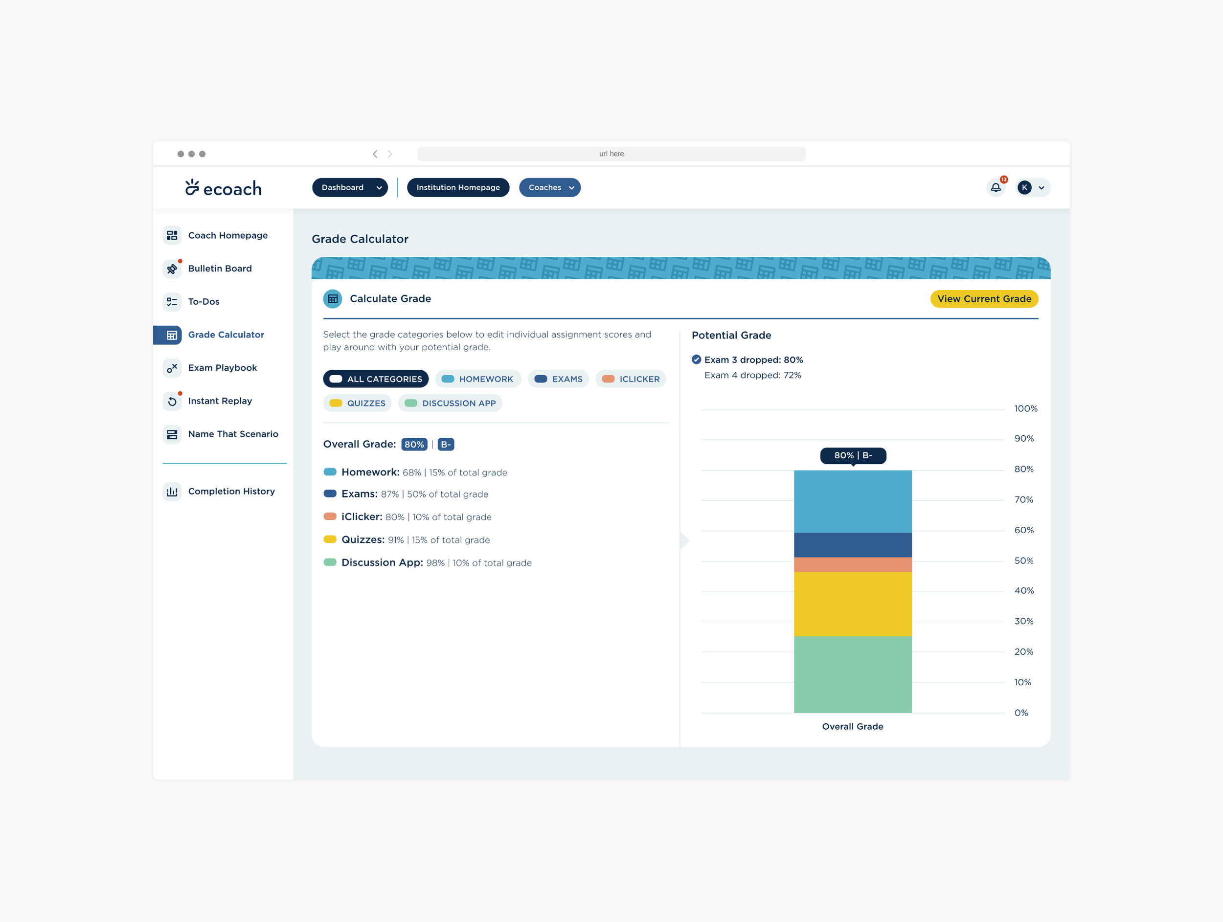
Grade Calculator to determine what future grades they’ll need to attain their goal grade


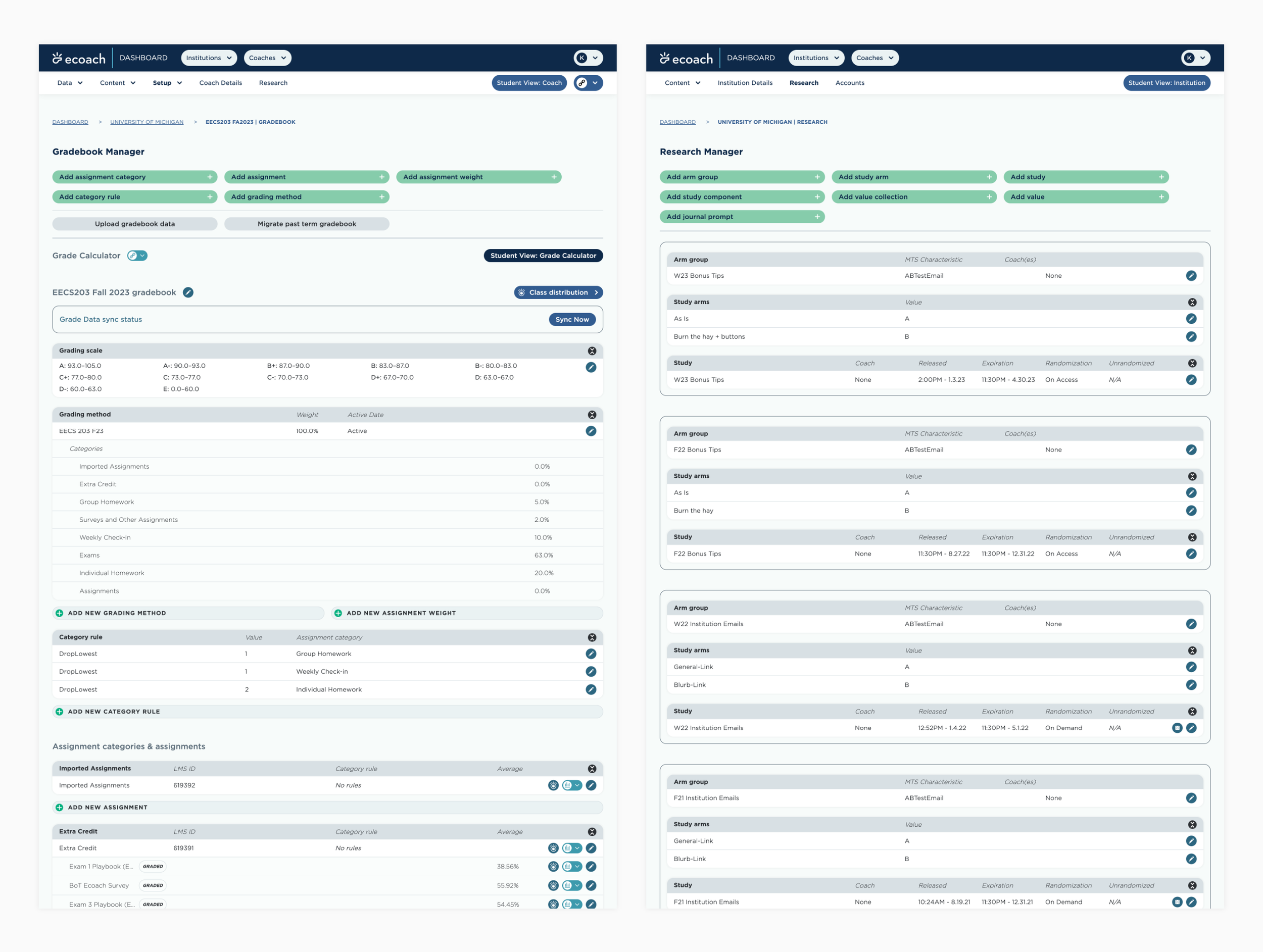
Dashboard Features
The dashboard is where all student-facing configurations are made. Faculty, GSIs, content managers, and our team use this side of the application, making it a comprehensive platform for a wide range of users. This is where all content is queued, gradebooks are managed, and student engagement is tracked. Additionally, it can conduct research studies (RCTs), which is a key ECoach feature.